Employee Engagement Manager
The Product
EEM brings greater efficiency and employee satisfaction to the workplace by providing mobile-friendly, self-service workforce scheduling.
The app is based on a legacy app of a company NICE acquired.
A cross-continental project: Product team located in the US, UX team in Israel and R&D team in India.
The app is available to download both from Google Play and Apple app store.
THE CHALLENGEs
Create efficiency both to the user and the organization
New and fresh experience
Employee satisfaction
Mobile-friendly
Self-service
Easy to use
Accessibility issues.
Updated look and feel
Work Process
First step was to explore the application and its different flows. Based on its previous designs.
RESEARCH: Legacy Application
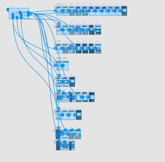
Different flows of the app
RESEARCH: Reviewing Google analytics reports of existing clients
Looking at the analytics reports of each client to collect interesting data such as: where do users spend their time in the app, what kind of OS they use, what devices, etc.
Understand our users
Wireframes and prototyping
Process:
Solve UX pain points in legacy app.
Create a simple and user friendly experience
Reduce complexity.
Add mobile gestures
An interactive prototype of the app (early iterations)
VISUAL DESIGN
Visual design process:
Updated look and feel with NICE brand.
Addressing accessibility issues.
Adding affordance.
Feedback
““I’m very happy to report how excited these teams were to see it in person.
They really love the new (modern) look & feel, and how the UX team and developers have implemented standard mobile app controls that make it even more intuitive to use.
Some specific positive comments were…
- Better (and more intuitive) shortcuts for Adjust Schedule and Trade at the bottom of the screen.
- Ability to slide up/down the daily shift details.
- The creative approach of how the monthly calendar becomes a “this week calendar” when expanding
- And how the shift details can scroll within its own window versus the entire mobile page scrolling off the top.
- Swipe down refreshes screen content while within interval selection mode.
- Having the entire agent row highlight versus a small check box for selection.
- They love the entire Preferences design. Quantum leap from the legacy app.
As you can see, it was a big hit.
Looking forward to the next generation!”


